House Ideas Clippings from various books and magazines of interesting ideas for Eric and Sylvia's future house.
|
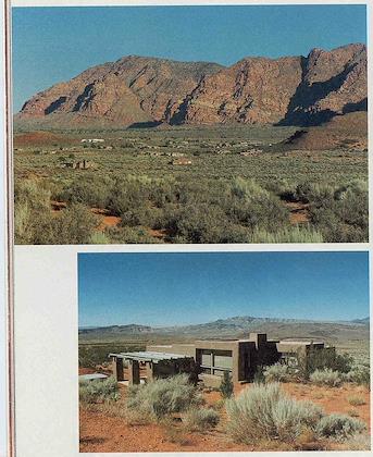 | | 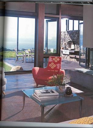 |
| Homes on huge lots in beautiful Utah | | I like the way there's not a lot of differentiation between indoors and out. |
| |
|
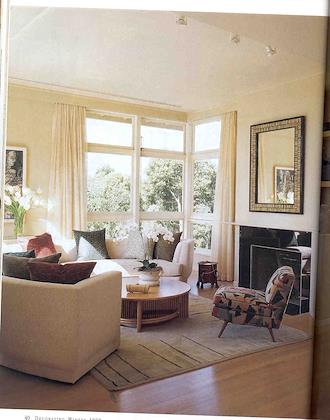 | | 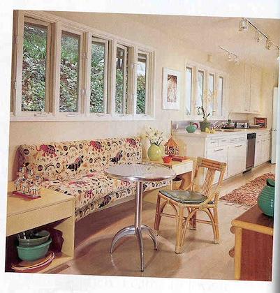 |
| Great l-shaped corner window, sunny room. | | I like the idea of a padded bench in the kitchen, although this table doesn't really fit. |
| |
|
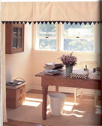 | | 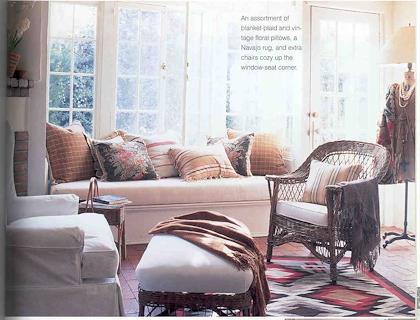 |
| Like the office tucked into a sunny corner | | I like the sunny window seat, but I have my doubts whether this would actually be comfortable, because you can't lean back on the glass. |
| |
|
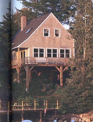 | | 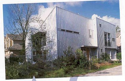 |
| I like the simple shape of this house. | | Like the modernistic outline. |
| |
|
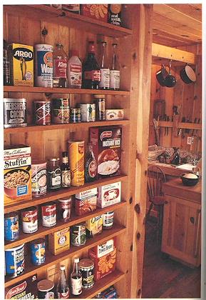 | | 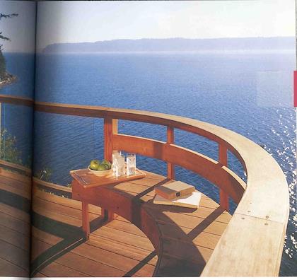 |
| Shallow shelves give you more efficient storage space, because you can see everything at a glance. | | What a view! |
| |
|
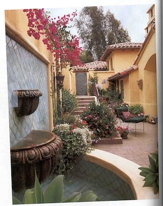 | | 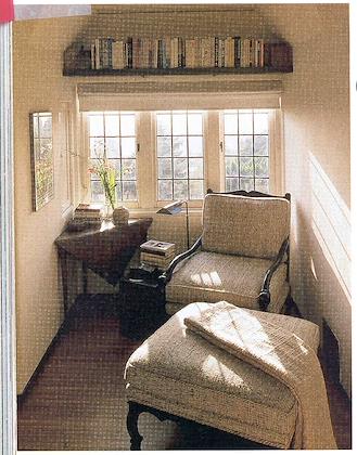 |
| If you can't have a view, having a private enclosed terrace like this would be nice. | | A wonderfully sunny quiet reading nook. |
| |
|
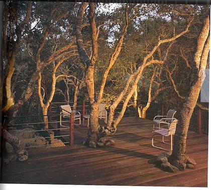 | | 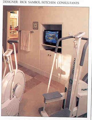 |
| I'd love to have a deck with trees growing through it like this. | | Seems like a good idea--have your exercise machines in the bathroom. |
| |
|
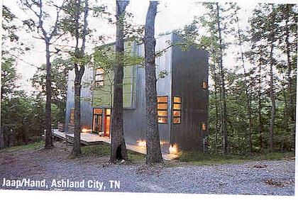 | | 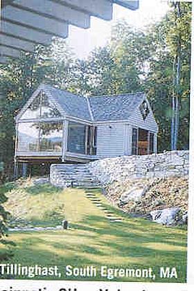 |
| I like the lines of this house... | | ...and this one. |
| |
|
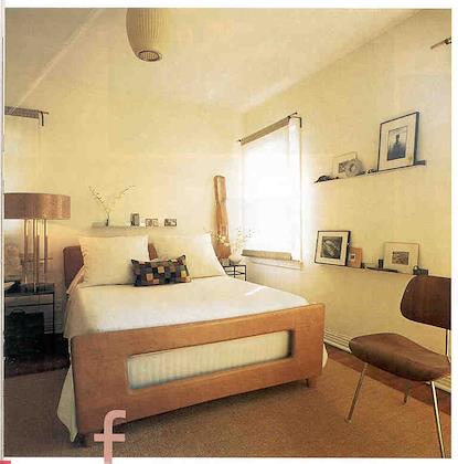 | | 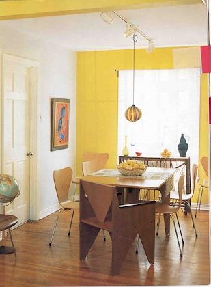 |
| The idea of having a little shelf where you could have a rotating assortment of pictures is great. | | Like the bright, colorful aspect of this room. |
| |
|
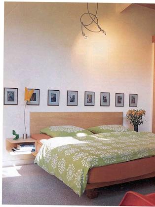 | | 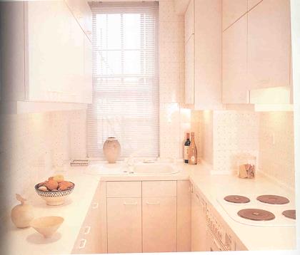 |
| Clean lines on bed. | | Everything is close together in this kitchen. |
| |
|
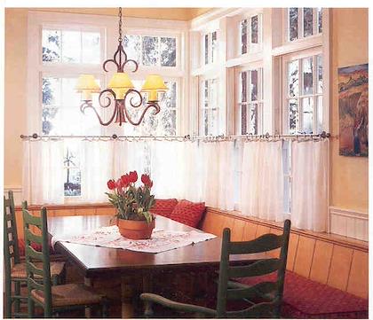 | | 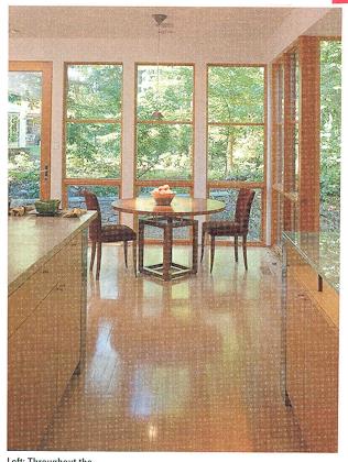 |
| Like the built-in benches and the cafe curtains, which give a lot of light and still offer privacy. | | Lots of windows, open to a nice green area. |
| |
|
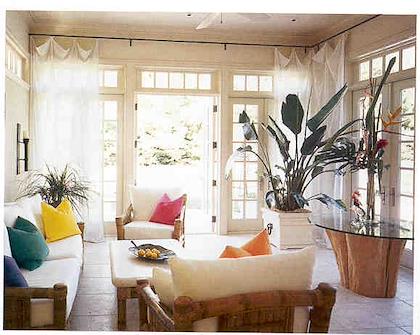 | | 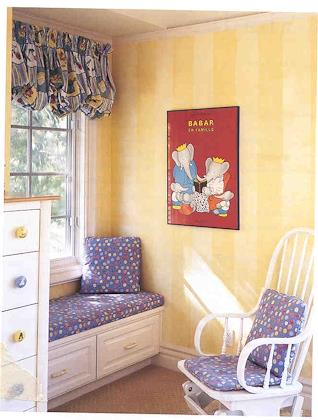 |
| Sunny room, open to the outdoors. | | Like the window seat. |
| |
|
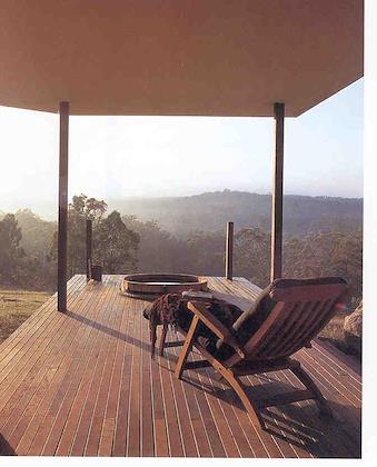 | | 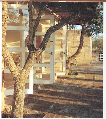 |
| A morning view like this... | | Open to the outdoors... |
| |
|
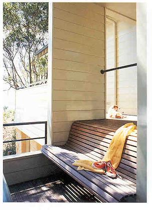 | | 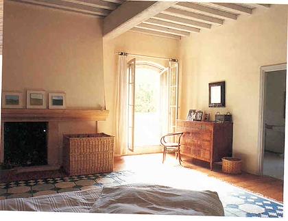 |
| A bench such as this one is a good way to be comfortable, yet outdoors. | | Open to the outdoors. |
| |
|
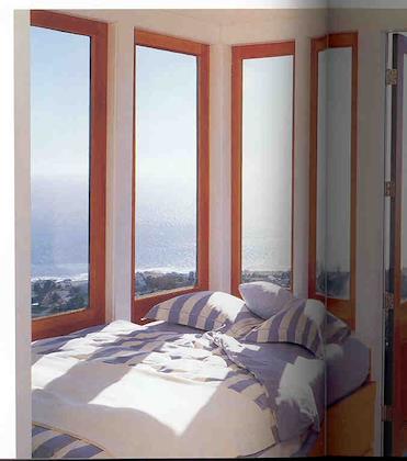 | | 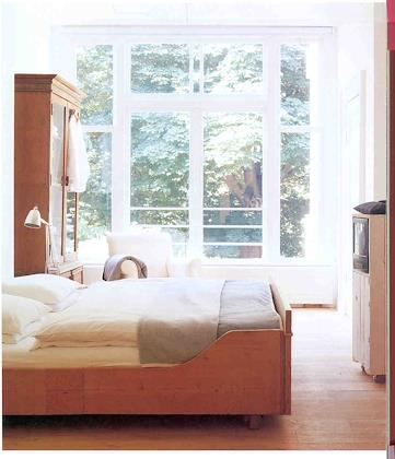 |
| Imagine having a view like this in the morning! | | Like the sun in this bedroom |
| |
|
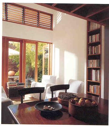 | | 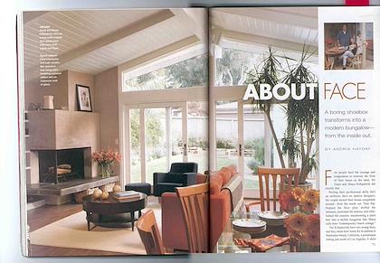 |
| Open to the outdoors, nice little patio... | | Open to the outdoors. |
| |
|
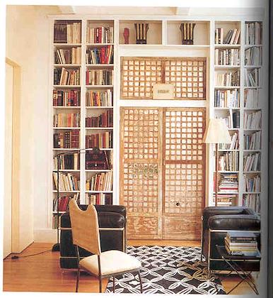 | | 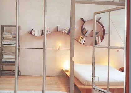 |
| Like the chairs. Not too sociable, though. | | I like the whimsical bookshelf. Not practical, but interesting if you made it yourself. |
| |
|
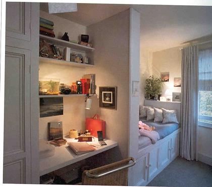 | | 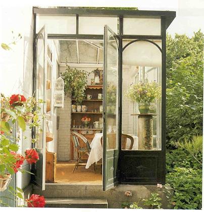 |
| Love the cozy bed, tucked in behind the wall. | | An eating area that's practically outdoors--how nice! |
| |
|
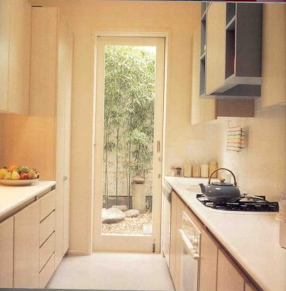 | | 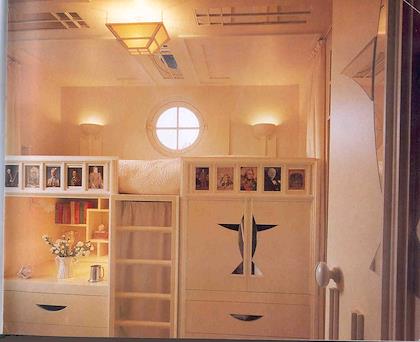 |
| I like this kitchen because everything is close together, very efficient, AND there's a beautiful door out to the patio. | | A cozy little retreat/bed that's also very efficient, built on top of a desk. |
| |
|
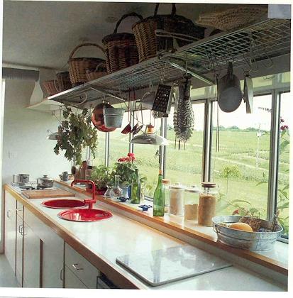 | | 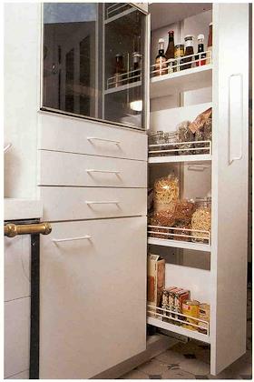 |
| I like having a broad vista through the kitchen window. Don't really like all the knick-knacks on the upper shelf, though. | | Pull-out shelving--very efficient. |
| |
|
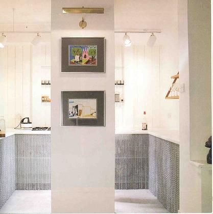 | | 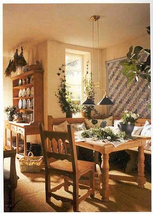 |
| The idea of chains hanging down instead of kitchen cabinets--very interesting. | | Love the sunny cushioned corner bench. |
| |
|
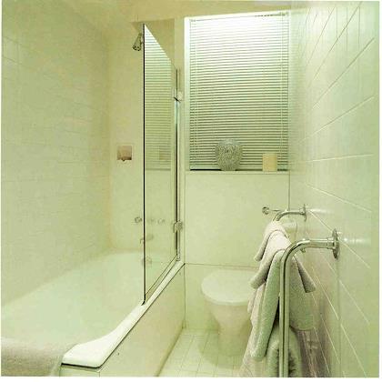 | |  |
| Interesting idea of having a pane of glass instead of shower curtains. | | Love the sky-light over the bed! |
| |
|
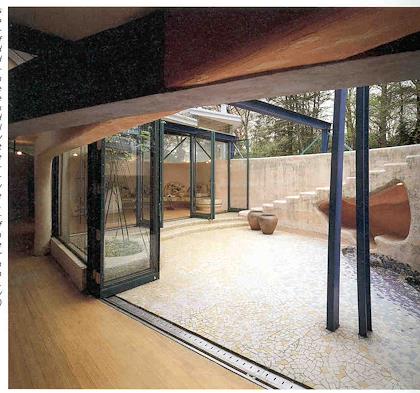 | | 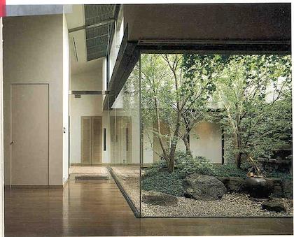 |
| If you can't have expansive views, I really like the idea of a private patio. Also like the extreme openness to the outdoors. | | A little atrium inside the house would offer a lot of light. I don't think I'd have the taller trees, though, because they block too much light. |
| |
|
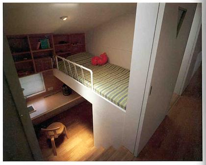 | | 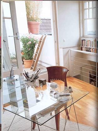 |
| A very cozy efficient bedroom. | | Like the openness to the outdoors here. |
| |
|
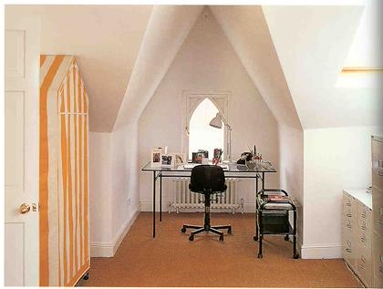 | | 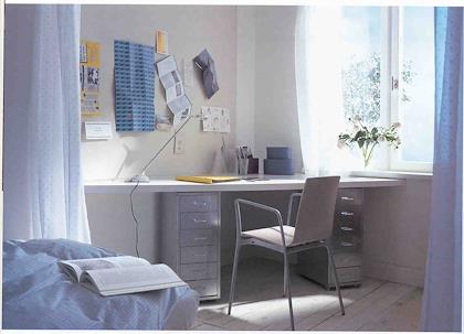 |
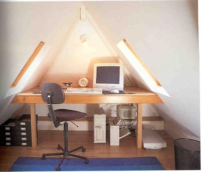
| I really like the slanted roof, and the fact that the desk is in a cozy cubbyhole here. | | I like the idea of a desk tucked into a corner. |
| |
|
 | | 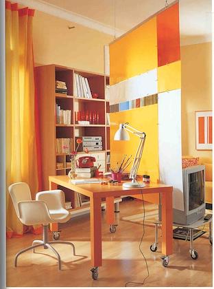 |
| Another office alcove. I could do good work here. | | Like the idea of a space separated by fabric hangings. Good way to screen space. |
| |
|
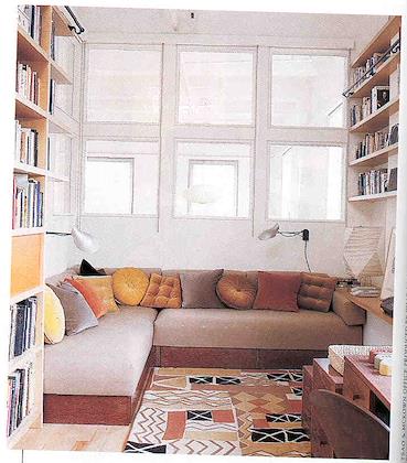 | | 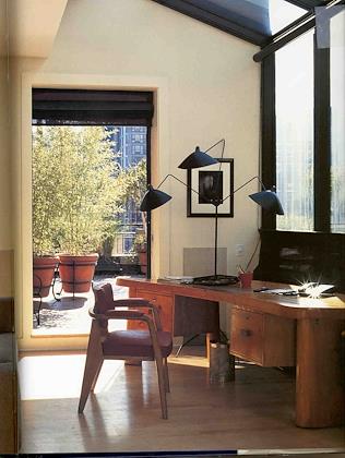 |
| I like the light and the fact that this is a cozy window seat area. Also, it looks like they're big enough to sleep on, so it could be a guest room as well. | | Open to a beautiful patio area. |
| |
|
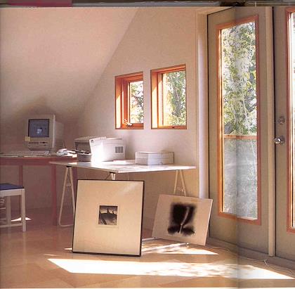 | | 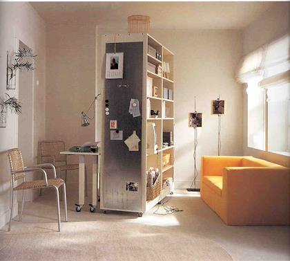 |
| Desk tucked away, steps away from the outdoors. | | Like the metal hanging on the wall, providing a place to hang stuff with magnets. |
| |
|
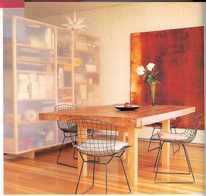 | |  |
| The semi-translucent covering of the shelving area is apparently something called envelope stiffener. | | Like the outline of this house. |
| |
|
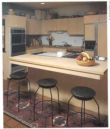 | | 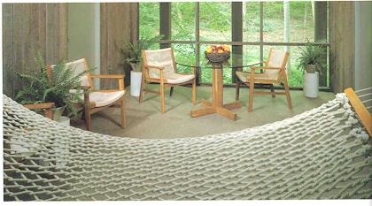 |
| Like the idea of having barstools in the kitchen, as an impromptu seating area. | | Like the openness to the outdoors. |
| |
|
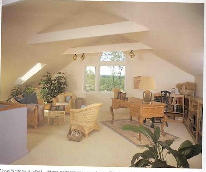 | | 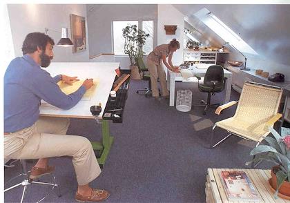 |
| I really like converted attic areas, as long as there's plenty of light via skylights, etc. | | Like the slanted roofs, skylights. |
| |
|
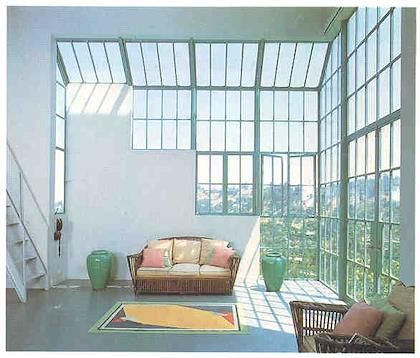 | | 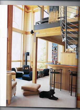 |
| So much light and such a great view! Cool efficient looking staircase, too. | | Sunken den area, very cozy. Like the spiral staircase too. |
| |
|
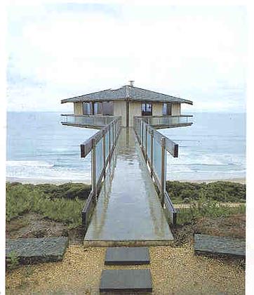 | | 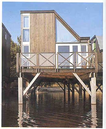 |
| Great view. Cool idea. | | Nice clean lines on this house. |
| |
|
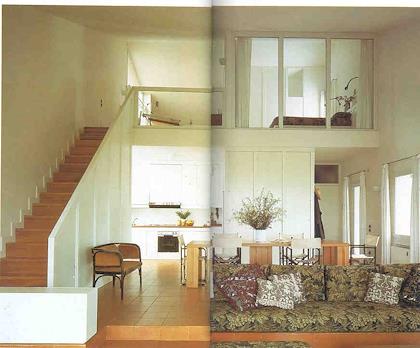 | | 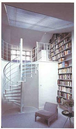 |
| Like the idea of having a room open up to the others, and possibly get light, via having one wall made of windows (with curtains, of course) | | Great spiral staircase. |
| |
|
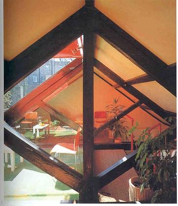 | | 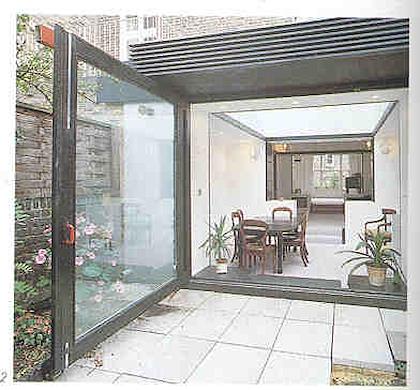 |
| A section of this attic was made into a small patio. | | Very open to the outdoors. |
| |
|
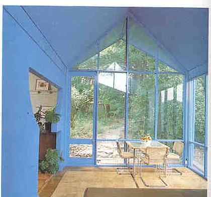 | | 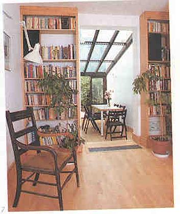 |
| I like the idea of multiple walls being made of glass. | | Like the glass overhead in this one. |
| |
|
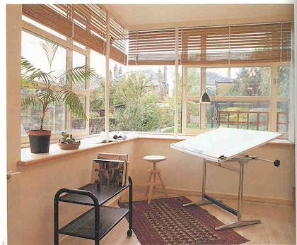 | | 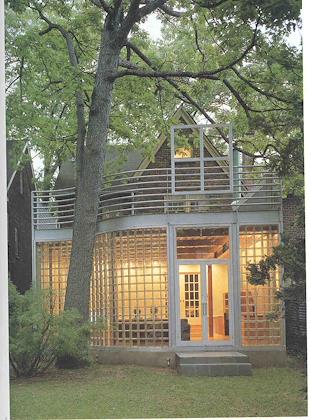 |
| Two walls with windows | | I like the lines on this renovation. |
| |
|
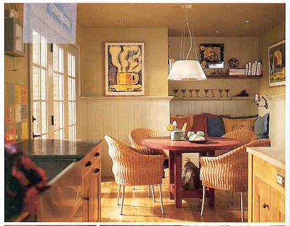 | | 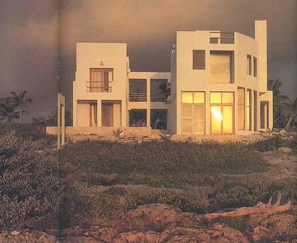 |
| I like the sun shining in, and the little bench seating area. | | Like the lines and the dramatic vies here. |
| |
|
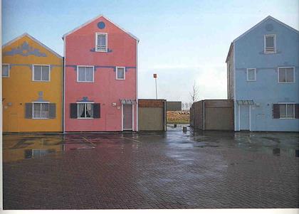 | | 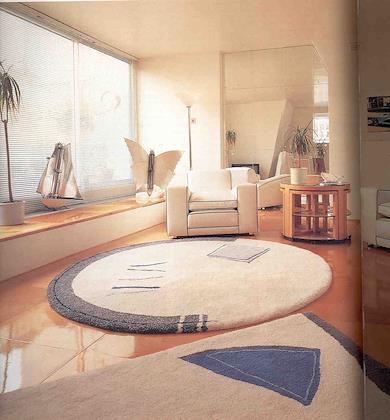 |
| Like the bright colors. | | Like the efficient plywood floors, yet also having some beautiful thick rugs. |
| |
|
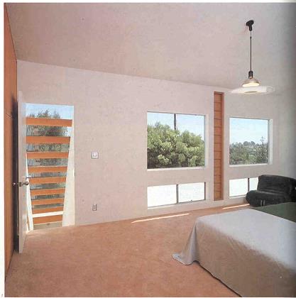 | | 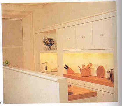 |
| Open to the outdoors | | Like the idea of having a little bit of an elevated wall around the kitchen, so you don't see the mess. |
| |
|
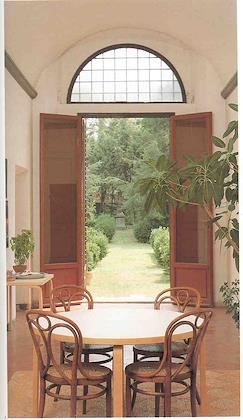 | | 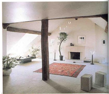 |
| Open to the outdoors. | | Like slanted roofed area with lots of light. |
| |
|
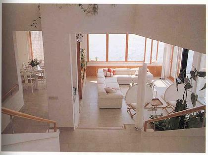 | | 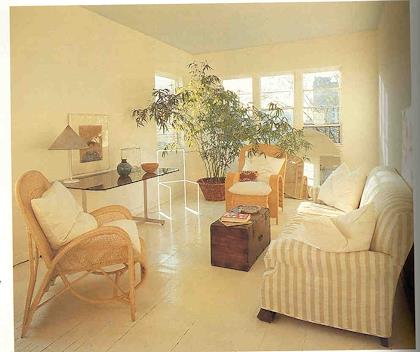 |
| Lots of windows and light! | | Clean cut, bright. |
| |
|
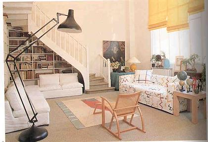 | | 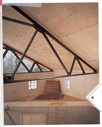 |
| Like the usage of space under the stairs, and the light. | | I like the idea of a little hideaway. |
| |
|
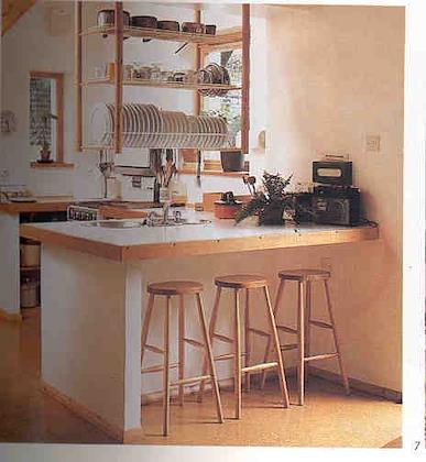 | | 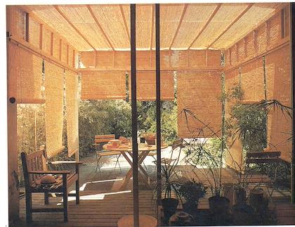 |
| Having dishes drain into the sink right underneath seems very efficient. | | A shaded outside eating area. |
| |
|
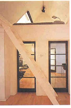 | | 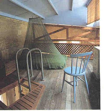 |
| Cozy space accessible via a ladder. | | And another one... |
| |
|
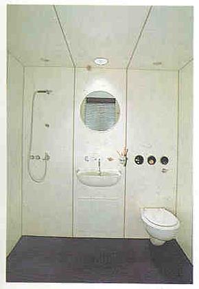 | | 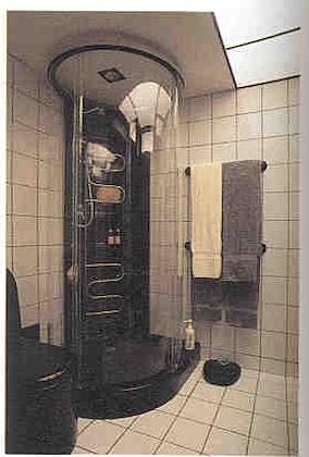 |
| A very efficient bathroom | | Good way to do a shower. |
| |
|
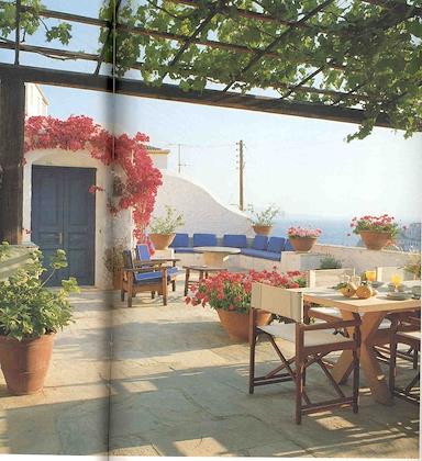 | | 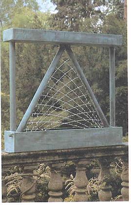 |
| I like the idea of having breakfast up here. | | This give me some ideas for garden fountains. You could just have a wide pipe, punch some holes in it. The holes at the bottom would have the water squirt out further. |
| |
|
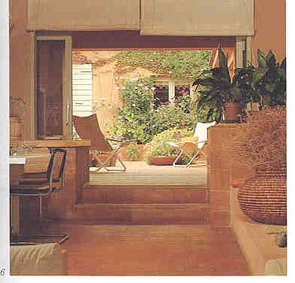 | | 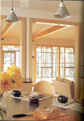 |
| I like the openness to the outdoors here. | | Nice view into the outdoors from the dining area. |
| |
|
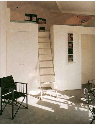 | | 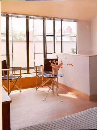 |
| Very efficient on space, and I like the idea of a sleeping loft. | | Open to an outdoors patio. |
| |
|
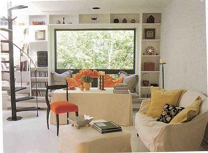 | | 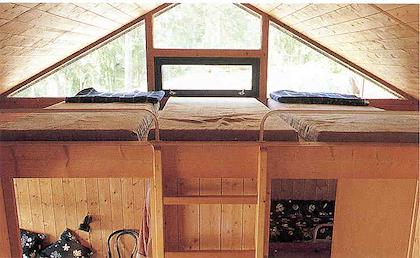 |
| Like the spiral staircase, and the simple, clean window. | | I like the bright sleeping loft. |
| |
|
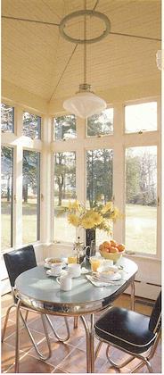 | | 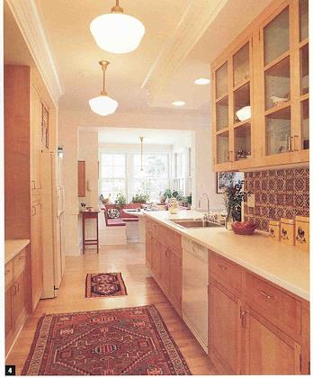 |
| A wonderful, bright eating area, with nice view. | | I like the oriental carpets in the kitchen. |
| |
|
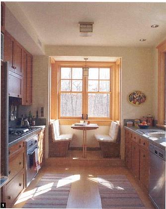 | | 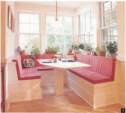 |
| Like the compact eating booth | | Another cute and sunny eating booth. |
| |
|
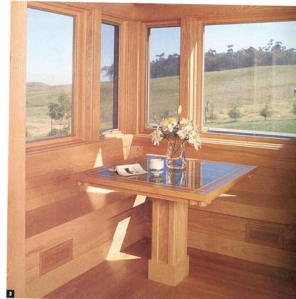 | | 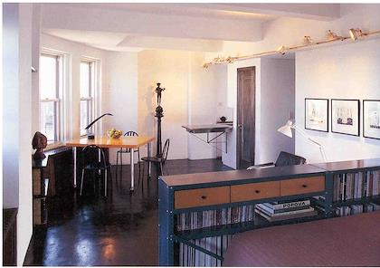 |
| And another! | | Simple efficient layout with a view of the city |
| |
|
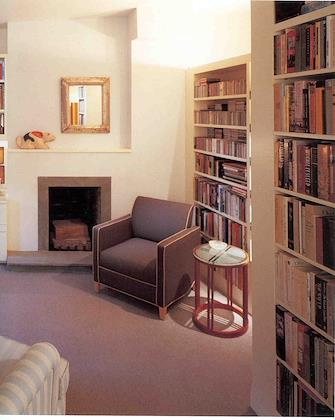 | | 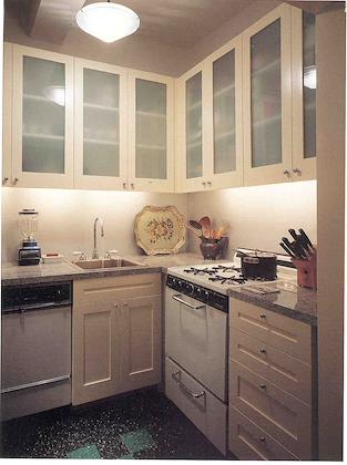 |
| Clean looking area for reading. | | I like the translucent kitchen cabinets. Probably cheaper than wood. |
| |
|
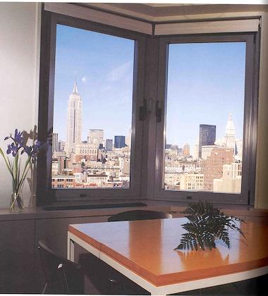 | | 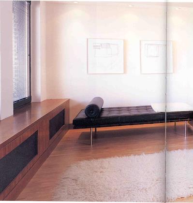 |
| Clean, simple eating area with a great view. | | I like the wrap-around bench on the outside wall. |
| |
|
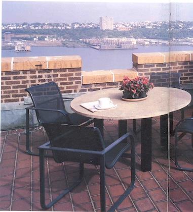 | | 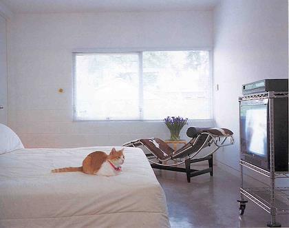 |
| A rooftop terrace--sweet! | | Simple room, using cinderblocks. Probably quite inexpensive. |
| |
|
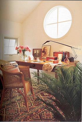 | | 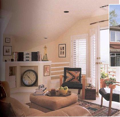 |
| Like the window. | | Like the deck outside. |
| |
|
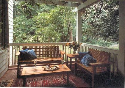 | | 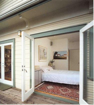 |
| Like the concept of semi-outdoor rooms. | | Having a door opening to a deck is like doubling the living space. |
| |
|
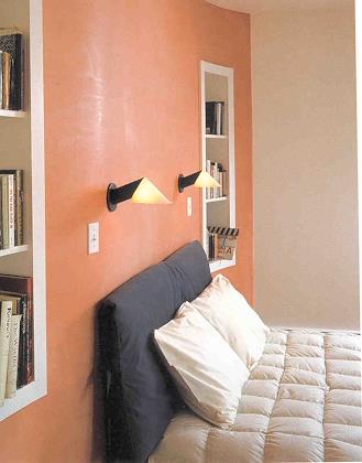 | | 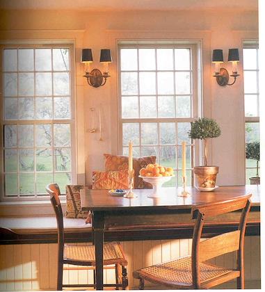 |
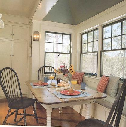
| Clean, simple bedroom. | | Another bench seat. |
| |
|
 | | 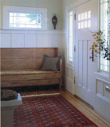 |
| And another. | | I like the idea of a bench just inside the front door, although it would have to have more storage than this one. |
| |
|
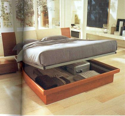 | | 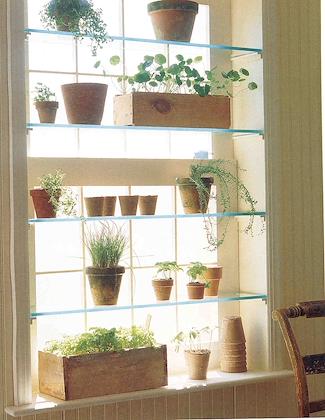 |
| Storage underneath the bed--great idea. | | What a super place to grow herbs. |
| |
|
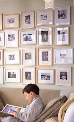 | | 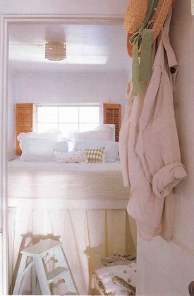 |
| I like the idea of having favorite pictures up on a wall, where you can look at them every day. | | A very small bedroom. Doesn't seem like the under-bed storage is very accessible. |
| |
|
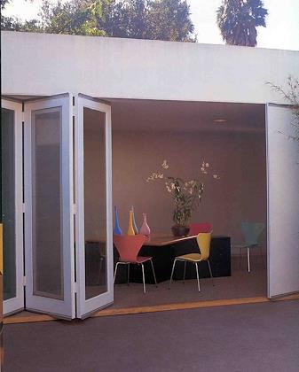 | | 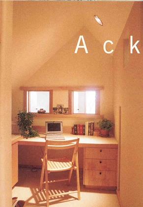 |
| Open to an outdoor patio. | | I love compact cubbyhole offices like this. |
| |
|
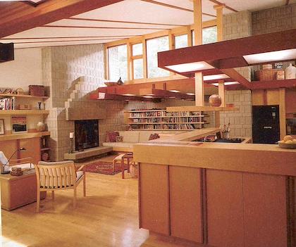 | | 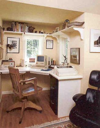 |
| I like the big wall of seating area here, plus how the kitchen is enclosed yet overlooks the living area | | Another small compact office |
| |
|
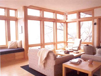 | | 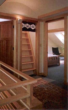 |
| Like the openness to the outdoors, the window seat, casual, comfortable seating | | Mini staircase up to a loft |
| |
|
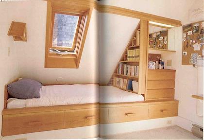 | | 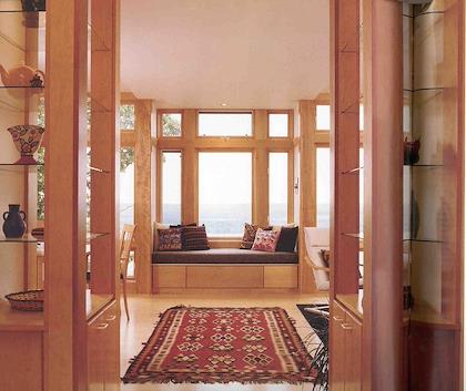 |
| I like the slanted ceiling over the bed here, with build-ins underneath | | Great view with a compact sociable living area. And window seats |
| |
|
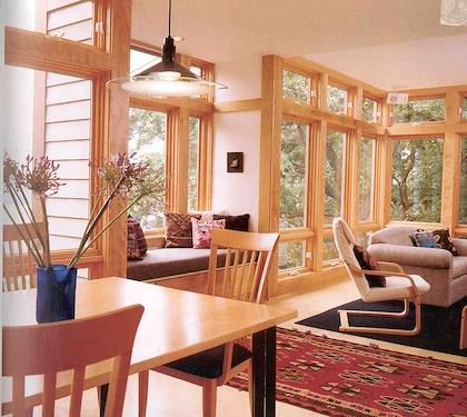 | | 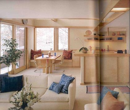 |
| Another view of the same house | | Dining area right next to kitchen, with built in seat. Light woods, deck outside, kitchen out of sight yet can see out |
| |
|
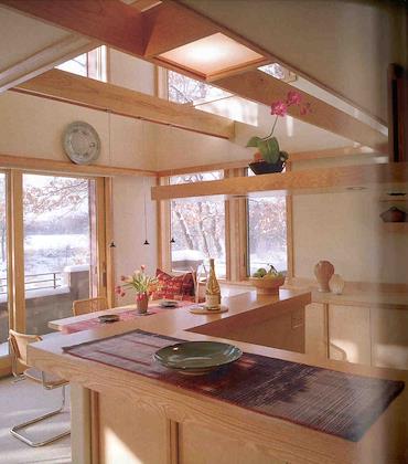 | | 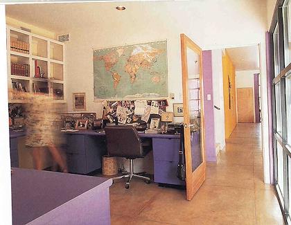 |
| Another view of the same house | |
| |
| 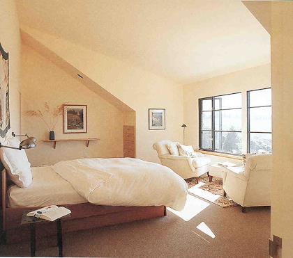 | | 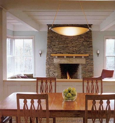 | | | In the background you see a sunken family room. I really like the idea of a cozy get-together room on a lower level than the main house, a place where you can sit on wall-to-wall carpet and hang out. |
| |
| 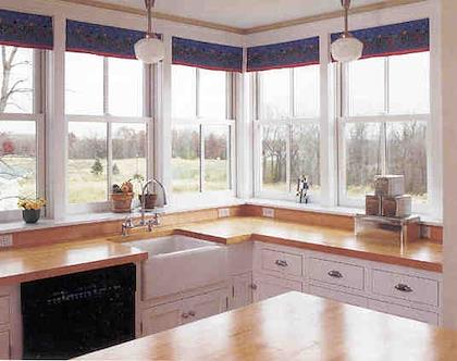 | | 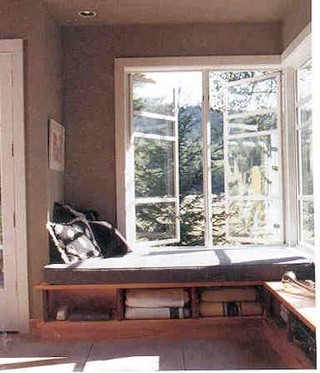 | | I really like corner windows. | | A combination built in window seat and guest bed--what a great idea! |
| |
| 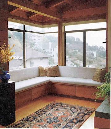 | | 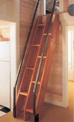 | | Corner windows, with built in window seats | | Where there's not a lot of space, this serves well as a staircase. Apparently the design is from Thomas Jefferson. |
| |
| 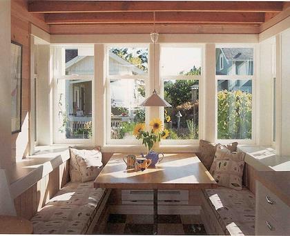 | | 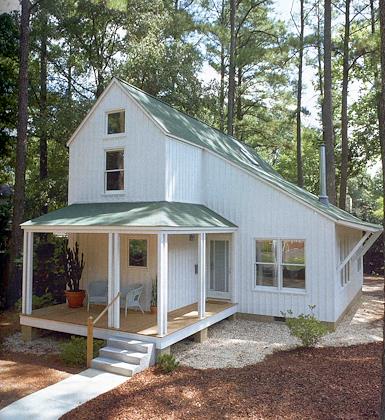 | | This is my favorite eating nook picture. I really like the windows on three sides, and the broad windowsills. The seats don't look that comfortable, though. | | I like the simple lines here, efficiently enclosing the space. |
| |
| 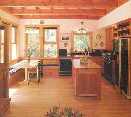 | | 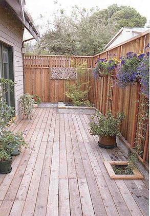 | | Fresh and sunny corner eating area, right next to a door allowing easy access to the outdoors. I like the close proximity to the kitchen as well. Who needs a dining room? | | If you can't have a great view, then having a private patio like this would be great. I think the plants would be pretty essential. |
| |
| 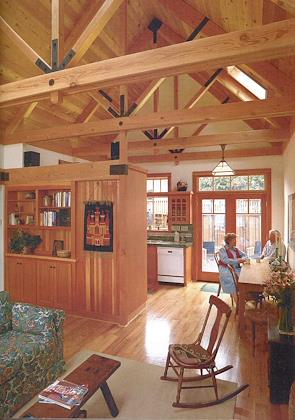 | | 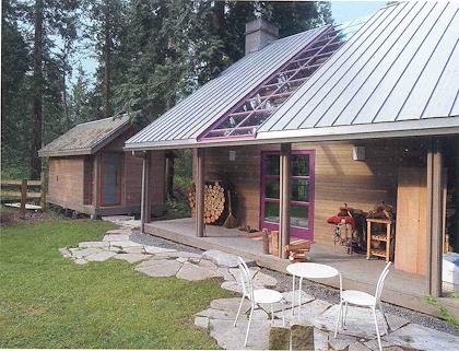 | | This is part of the same house. I like the french doors to the patio area | | Having an enclosed patio like this along the side of a house makes the outdoors seem a part of the house, and increases the useable space without much extra expense. |
| |
| 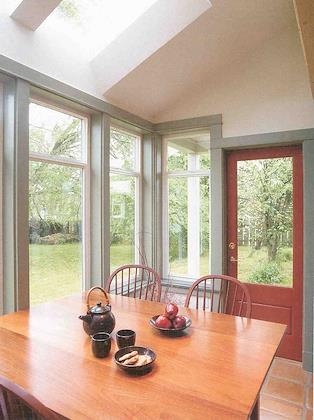 | | 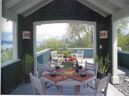 | | Simple, clean lines, corner windows, lots of light, and access to the outdoors are what attract me to this one. | | I love rooftop patios! |
| |
| 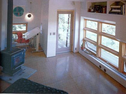 | | 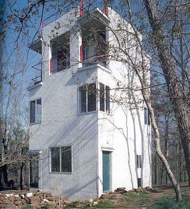 | | Like the idea of varnished plywood as flooring. Economical, simple. | | The idea of a skycraper in the woods is appealing...also the idea of each floor having lots of privacy. |
| |
| 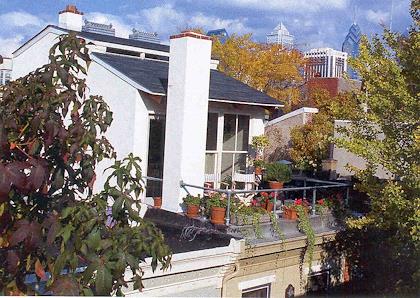 | | 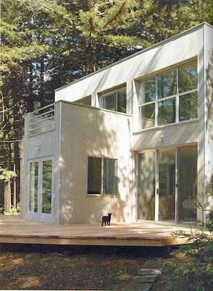 | | Another charming rooftop patio. | | Why do I like this one? The clean lines, and also because there's muliple access points to a very simple, elegant deck area. |
| |
|  | |  | | |
| |
|  | |  | | |
| |
| 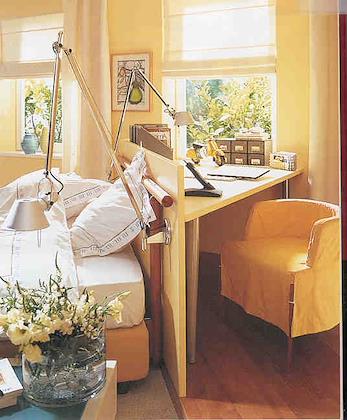 | | 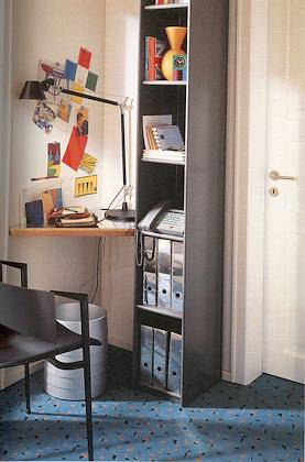 | | |
| |
| 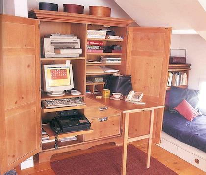 | | 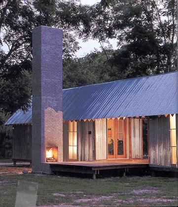 | | |
| |
|  | |  | | |
| |
|  | |  | | |
| |
|  | |  | | |
| |
|  | |  | | |
| |
|  | |  | | |
| |
|  | |  | | |
| |
|  | |  | | |
| |
|  | |  | | |
| |
| 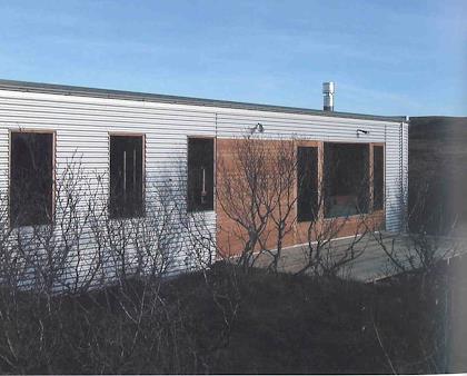 | | 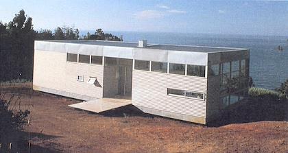 | | Some interesting prefab houses. This one was built in Iceland | | Chile |
| |
| 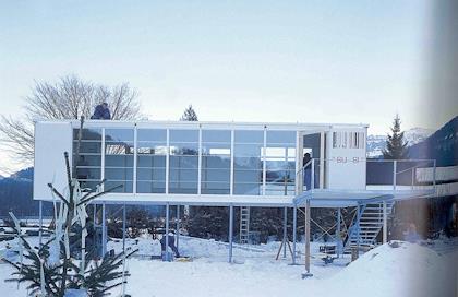 | | 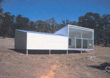 | | | Australia |
| |
|  | |  | | |
| |
|  | | | | | | | | | | | | | | | | | | | |